


We use essential cookies for the proper functioning of the website and additional ones to make interaction with the site as convenient as possible. It helps us personalize your user experience as well as obtain analytical information to improve the service.
If you agree to accept all cookies, click "Accept all"; if not, click "Only essential". To learn more, view the Cookie Policy.
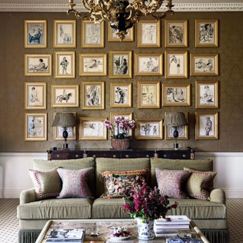
Designers talked about the use of frames in interior design
The use of frames in the interior is a rather delicate topic. Someone prefers classical painting, someone - Japanese miniatures, someone - a series of photographs. Interior designers have provided some tips for placing frames.
When decorating an apartment or house with frames, it is worth adhering to one important rule - the presence of balance. This applies to the height of the location, the number of items, color combinations and more.
The optimal placement height is ⅔ of the height of the entire wall. It turns out that if the wall surface is conventionally divided into three parts, then a picture in a frame or a series of pictures should be located practically on the border of the second and third parts from the ceiling.
The number of images within the frames can be any. The main thing is that they do not "climb" on top of each other. It is important, even in different sizes or orientations - vertical / horizontal, they should complement each other.
From the point of view of color, preference should be given to light frames. They even visually brighten the image inside. Even some colors are starting to look different. Nevertheless, the dark frames do their job. For some, they are considered even more solid.
And we must not forget about the combination with the general style of the room. Everything that is framed should complement the existing space, not contradict it.