
Orange in the interior: tips from OXO
Orange, symbolizing joy, warmth and self-knowledge, is in great demand when decorating the dining area. A wide range of shades allows you to create a bright and rich interior in the room. Okho will talk about the main subtleties of the combination of orange color in interior design.
When painting walls, opt for a soothing shade of matte texture. Overly flashy options with a yellow or gold glow look intrusive and "simplify" the room. Burnt wallpaper with an exquisite pattern goes well in the dining room with the rest of the interior.
To add freshness and energy to the room, we recommend painting the ceiling orange. The solution looks spectacular, in which the central part of the ceiling zone remains white, and only some of its elements are painted in a bright color.
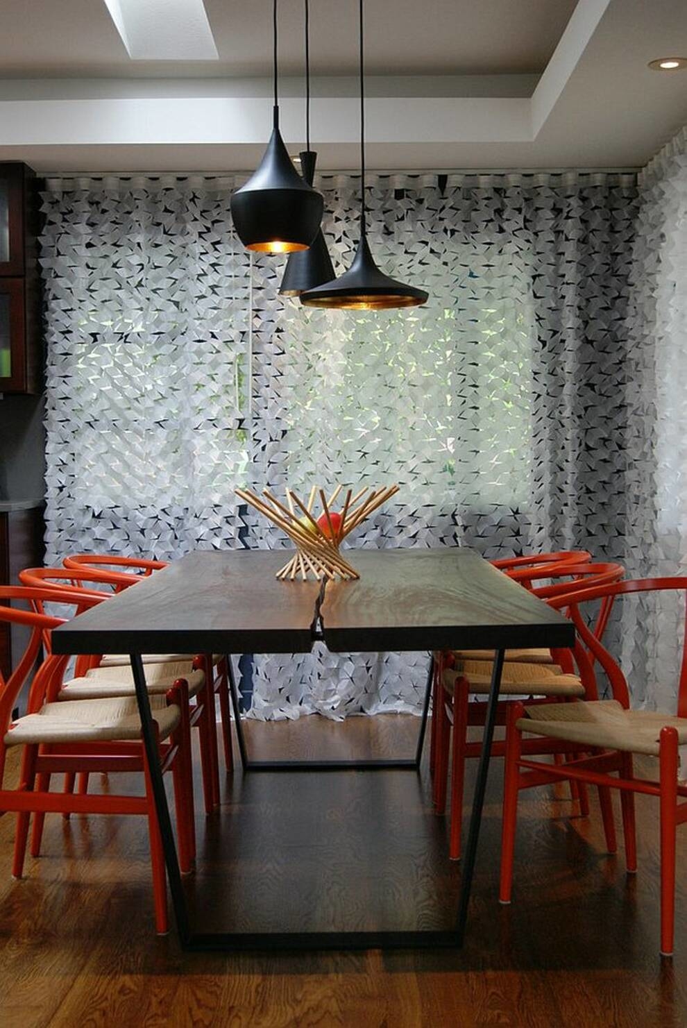
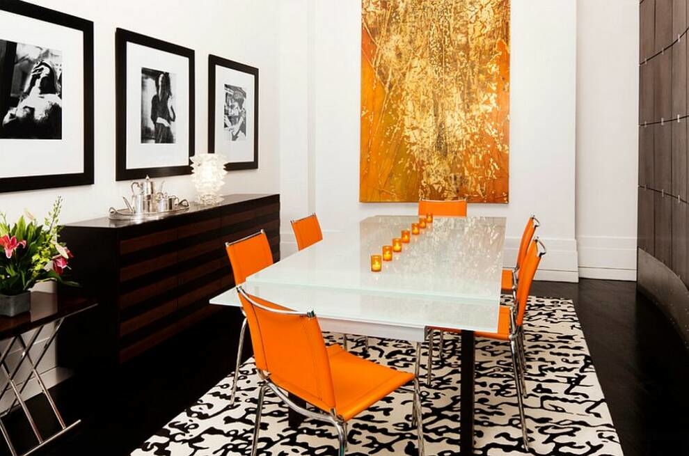
Orange can easily dilute a too boring interior. A sideboard, wardrobe or chair in a sunny shade (against the background of reigning white, beige or gray) will become a pleasant accent that will attract the attention of guests of the house.
Dark or muted shades of orange will fit well into the interior of the dining room in any stylistic direction.
Orange is a good color for open-plan apartments. With the help of it, individual zones can be combined into a single composition. For this purpose, separate decor items are suitable. For example, a carpet, vase, lamp or pouf.
The nice bonus of orange is that it blends well with other shades. Orange looks gorgeous against a background of black, gray, white and yellow. Variations with green and blue are bold but striking.
In the section "Interior" you will find everything you need to make an ohm design in orange tones.


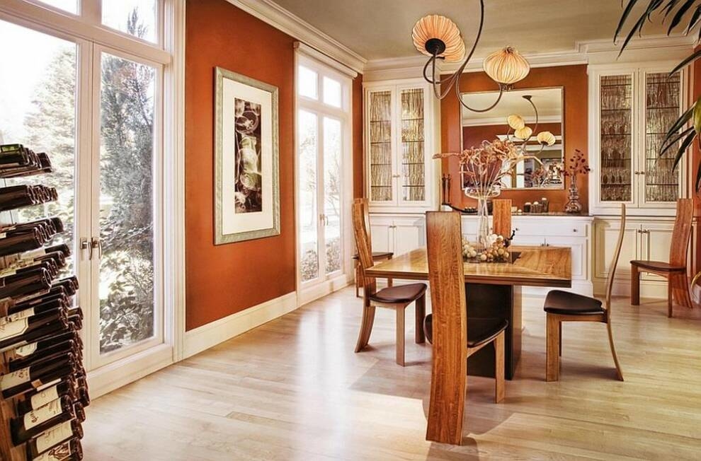


When painting walls, opt for a soothing shade of matte texture. Overly flashy options with a yellow or gold glow look intrusive and "simplify" the room. Burnt wallpaper with an exquisite pattern goes well in the dining room with the rest of the interior.
To add freshness and energy to the room, we recommend painting the ceiling orange. The solution looks spectacular, in which the central part of the ceiling zone remains white, and only some of its elements are painted in a bright color.
Orange can easily dilute a too boring interior. A sideboard, wardrobe or chair in a sunny shade (against the background of reigning white, beige or gray) will become a pleasant accent that will attract the attention of guests of the house.
Dark or muted shades of orange will fit well into the interior of the dining room in any stylistic direction.
Orange is a good color for open-plan apartments. With the help of it, individual zones can be combined into a single composition. For this purpose, separate decor items are suitable. For example, a carpet, vase, lamp or pouf.
The nice bonus of orange is that it blends well with other shades. Orange looks gorgeous against a background of black, gray, white and yellow. Variations with green and blue are bold but striking.
In the section "Interior" you will find everything you need to make an ohm design in orange tones.
Photo © museum-design.ru
Photo © museum-design.ru
Photo © museum-design.ru
Photo © museum-design.ru
Photo © museum-design.ru
Photo © museum-design.ru
Photo © museum-design.ru
Photo © museum-design.ru
Photo © museum-design.ru
Photo © museum-design.ru
Photo © museum-design.ru
Photo © museum-design.ru
Photo © museum-design.ru
Photo © museum-design.ru
Photo © museum-design.ru
Photo © museum-design.ru


