Google has updated the icon for its search engine
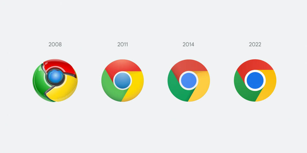
Google has announced a new logo. This has happened in the last 7 years.
Updates touched the brightness of the icon, as well as the shadows. The latter will be completely removed from the drawing. Also, the blue circle placed inside will become much larger.
According to the developers, the old icon has been completely redesigned. The proportions were simplified, the shadows were removed, the colors were made richer and brighter. The main goal was to make an icon that would correspond to the directions of the brand.
In order to avoid color dissonance, it was decided to add gradients. So the color transitions were smoothed out.
We tried to adapt the appearance of the icon to the maximum to different operating systems. For versions 10 and 11, a relatively smooth look was made, and for OS, brighter colors were used with no gradient. So it turned out to synchronize the color and the rest of the icons on the screen.
It was noted that the updated logos will appear on all devices before the beginning of spring.
As for the test versions, a drawing design will be used for them. This was designed for developer apps.
According to user reviews, it can be judged that they are in anticipation of new products. But they are still waiting for approbation empirically.
You can find devices for testing new products from Google on the OXO website in the section "PCs, laptops, tablets, office equipment". Among more than 2.2 thousand active lots, computer equipment, servers and components, monitors, working and game manipulators are exhibited.